

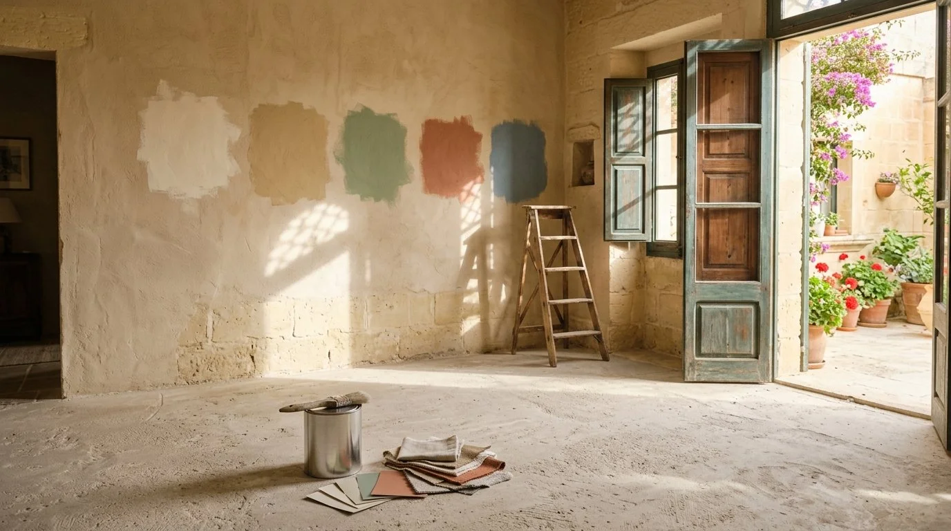
Colour test patches in sand, sage green, terracotta and sea blue on a limestone wall in an unfinished Gozo home
You fell in love with a shade in a magazine, in a showroom or in your previous home. You paint it in your new place in Malta or Gozo, and something is off. It looks harsher, flatter or yellower than you expected.
This is one of the most common frustrations I hear from expats and foreign buyers, and it has nothing to do with taste. Choosing paint colours here works differently, because the light, the materials and the way people live in a Mediterranean home are different.
Whether you live on the island, in Malta with a project in Gozo, or you are still abroad, here is how I approach colour in every home I design.
Why paint colours look different in Malta and Gozo
Light in Malta and Gozo is stronger, brighter and warmer than in northern Europe. Direct sun can wash out a pale colour until it looks almost white at midday, then turn it golden in the late afternoon. In rooms with little direct light, the same colour can look grey and heavy.
Many homes here are also built in limestone, a warm honey toned stone that reflects on walls, floors and ceilings. A colour never sits alone, it always interacts with the materials around it. This is why a palette copied from another country rarely works without adjustment.
Room orientation comes first
Before choosing a colour, I look at how the sun moves through the property. A south facing room receives strong light for most of the day, and softer, muted colours often work better than very bright ones. A north facing room, or a ground floor space with narrow openings, receives cooler and flatter light, and it can handle warmer and richer tones.
I check this room by room during the site survey, because orientation can change the final result more than the colour itself.
Start with a feeling, not a shade
Before opening a colour chart, I ask one simple question: how do you want to feel in this room? Rested, energised, wrapped, focused, cheerful? The answer matters more than any trend, and it guides every choice that follows.
How I understand your taste in colour
Most clients struggle to put words on what they like. They say something calm or not too dark and the conversation stops there. This is why my onboarding questionnaire includes a visual colour preselection. Not every designer works this way, and it makes a real difference.
I show ten colour directions and ask which ones appeal to you and which ones you would rather avoid:
Pastel tones, such as blush, powder blue, sage and buttercream
Vibrant tones, such as coral, teal, mustard and emerald
Botanical greens, such as olive, eucalyptus, forest and sage
Mineral neutrals, such as greige, taupe, clay and charcoal
Floral hues, such as dusty rose, lavender, peony pink and lilac
Water and coastal shades, such as aqua, seafoam, blue grey and deep navy
Warm neutrals, such as beige, sand, camel and warm white
Cool neutrals, such as cool white, silver grey, slate and graphite
Monochrome accents, black and white with high contrast
Metallic accents, such as brass, bronze and chrome
Seeing colours is much easier than describing them. Your choices tell me about the atmosphere you are looking for, and what you reject tells me just as much. I then read your answers through the reality of the property: its light, its orientation, its limestone, its floors and its size.
Choosing wall colours room by room
Each room has its own use, and a few directions work well as starting points. They are not strict rules.
Bedrooms: soft, muted and slightly warm tones such as sand, clay, dusty sage or faded blue help a room feel restful.
Living rooms: this is where you can be most personal. Earthy shades, deep greens or warm neutrals create a welcoming base for gatherings and pair beautifully with natural materials.
Kitchens: fresh and cheerful colours work well, but they need to be easy to live with every day.
Bathrooms: calm, clean and slightly soft palettes make the room feel like a small retreat.
Home office: avoid overstimulation. A balanced, softly coloured wall helps concentration, which matters for the many expats who work from home on the island.
Terraces and outdoor areas: warm, natural tones that echo limestone, plants and sea feel effortless.
One colour throughout or a full palette?
One of the biggest fears I hear is a home that looks bariolé, with each room telling a different story. There are two ways to avoid it, and I choose between them depending on the project.
The first is a single base colour used throughout the property. It works particularly well in open plan spaces, in smaller apartments and in rental properties, where continuity makes the home feel larger and more coherent.
The second is a main palette, usually three to five colours, with each one appearing differently in each room. A shade that is the main wall colour in the living room can return as an accent in a bedroom, in a cushion, a rug or a piece of ceramics. The result is a home that flows, with variety but without chaos.
This matters especially in shell form conversions and renovated houses of character, where rooms often open onto one another.
The white question
White is the most requested wall colour and also the most misjudged. A pure bright white under strong sun can feel glaring and cold, and it shows every shadow and every imperfection of the wall. Whites with a touch of warmth, such as soft cream, chalky off white or light sand, usually feel calmer and sit beautifully next to limestone.
Mediterranean colour palette ideas
Malta and Gozo give you a ready made palette: limestone, warm sand, sea blue, the green of capers and olive trees, terracotta pots, faded painted doors. Drawing from these tones creates interiors anchored to where you live, without turning into a theme. If your preselection leans towards sand, sea or olive tones, the island almost does the work for you.
Always test paint colours in the real room
A small sample card tells you almost nothing. I recommend painting large test patches directly on the wall, or on a board you can move around, and looking at them in the morning, at midday, in the evening and under your artificial lighting. Look at them next to your floor, worktop and furniture. It takes a few days and can save you from repainting an entire home.
Paint finish matters too
The same shade in matt, satin or gloss will not look the same. In a bright Mediterranean room, very shiny finishes reflect sunlight and show every flaw, while a good matt finish feels softer and more refined. In kitchens and bathrooms, I choose finishes that withstand humidity and cleaning, a point I develop in my articles on kitchen and bathroom renovation in Malta and Gozo.
Materials count as much as paint
A colour is never alone. A linen curtain, a wooden table, a tiled floor or a handmade ceramic lamp all change how a palette feels. Mixing textures makes a restrained palette feel rich and gives warmth to rooms that might otherwise feel flat.
Colours for a holiday rental
If your property is a holiday rental, guests need to feel good within seconds. Neutral and warm foundations with a few memorable accents photograph well and suit a broad audience. I cover the wider approach in my article on designing a holiday rental in Gozo.
Why colour belongs in the design phase
Not every designer builds a colour plan as part of the project, and it is often left to the final week when the painter is already waiting. In my process, colour is never a separate service. It is part of every full project I design, from shell form conversions and full renovations to the complete styling of a property. Colours, materials, lighting and furniture are designed together from the moodboard stage, so the home feels coherent when you walk in on the first day and you avoid expensive repainting.
